
Retro Color Psychology: Why Certain Vintage Palettes Feel So Right
Share
Color isn't just visual—it's emotional, psychological, and deeply personal. In the world of retro fashion, understanding color psychology isn't about following trends; it's about discovering which vintage palettes resonate with your authentic self and learning to build a wardrobe that feels genuinely, instinctively you.
Your retro color preferences reveal more than just aesthetic taste—they reflect your personality, your emotional relationship with different eras, and your unconscious connection to the cultural moments that shaped those color stories. Whether you're drawn to the warm, analog tones of the '70s or the bold, synthetic brights of the '80s, your color choices are a window into your analog soul.
Take our Analog Frequency Quiz to discover your authentic color DNA →
The Psychology of Retro Colors: Why Vintage Palettes Feel Different
🧠 The Science Behind Color Memory
Neuroscience research shows that colors trigger emotional memories more powerfully than almost any other sensory input. When you see a specific shade of orange, your brain doesn't just process "orange"—it recalls every emotional association you have with that color, including cultural moments, personal experiences, and inherited aesthetic preferences.
Retro colors feel different from modern palettes because they carry cultural weight. These aren't just aesthetic choices—they're time capsules of entire eras' hopes, fears, technological capabilities, and social movements. When you wear authentic vintage-inspired colors, you're not just choosing a palette; you're connecting with the emotional energy of specific cultural moments.
Why Vintage Colors Feel More "Real"
Limited Technology Created Authentic Palettes: Before digital color correction and synthetic dyes, color palettes were constrained by available materials and printing techniques. This limitation created harmonious, naturally-occurring color combinations that feel more organic than today's infinite digital possibilities.
Cultural Consensus Created Emotional Weight: Each decade's dominant colors weren't arbitrary—they reflected the era's social mood, technological advances, and collective aesthetic vision. These colors carry the emotional resonance of shared cultural experiences.
Imperfection Created Character: Vintage printing and dyeing techniques created subtle variations and imperfections that gave colors depth and character. Modern reproductions often feel flat because they lack these natural inconsistencies.
Retro Color Evolution: A Decade-by-Decade Journey
1960s: Optimistic Brights and Psychedelic Exploration
Defining Colors: Electric blue, sunshine yellow, hot pink, lime green, orange
Cultural Context: The '60s palette reflected boundless optimism, space-age technology, and psychedelic consciousness expansion. These colors were meant to be felt as much as seen.
Modern Appeal: Appeals to people who want to project confidence, creativity, and positive energy.
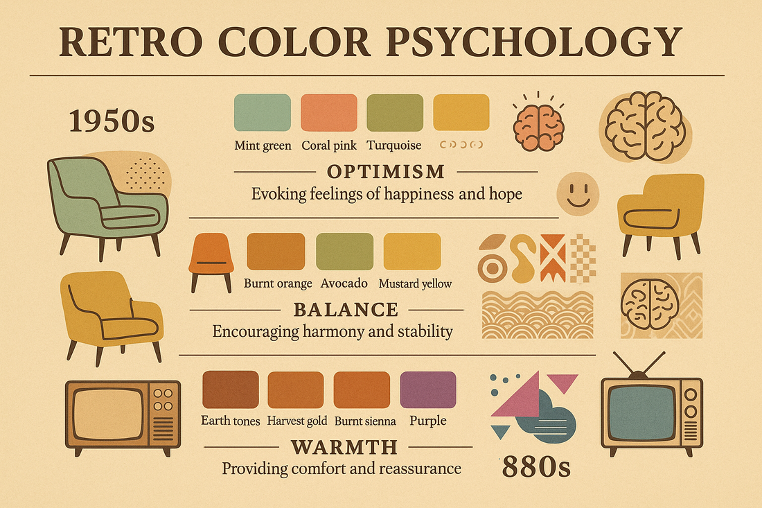
1970s: Earth Tones and Analog Warmth
Defining Colors: Burnt orange, harvest gold, avocado green, chocolate brown, rust
Cultural Context: Post-hippie earth consciousness met industrial design, creating colors that felt both natural and manufactured—perfectly capturing the decade's tension between idealism and reality.
Modern Appeal: Resonates with people who value authenticity, craftsmanship, and organic beauty.
1980s: Synthetic Brights and Neon Dreams
Defining Colors: Electric pink, neon green, bright purple, cyan blue, chrome silver
Cultural Context: MTV culture and emerging technology created a palette that celebrated artificial over natural—colors that could only exist in a digital, synthetic world.
Modern Appeal: Attracts people who embrace bold self-expression, technological optimism, and dramatic visual impact.
1990s: Muted Rebellion and Alternative Palettes
Defining Colors: Forest green, burgundy, sage, dusty rose, charcoal gray
Cultural Context: Grunge and alternative culture rejected the '80s brightness for more sophisticated, muted tones that felt authentic and anti-commercial.
Modern Appeal: Speaks to people who value subtlety, intellectual depth, and understated sophistication.
Your Retro Color Personality: The Four Analog Archetypes
Your retro personality influences not just your style preferences, but your deep psychological relationship with color. Each analog archetype gravitates toward specific palettes that reflect their emotional approach to vintage culture and self-expression.
🎵 The Vinyl Virtuoso: Warm Analog Tones
Vinyl Virtuosos are drawn to colors that feel substantial, aged, and authentic—palettes that could have been pulled from classic album artwork or vintage hi-fi equipment. Your colors tell stories and improve with time.
Your Color Psychology:
You're drawn to colors with heritage and weight—shades that feel like they've been aged in oak barrels or sun-faded on album covers. These colors reflect your appreciation for authenticity, craftsmanship, and the patina that comes with time.
The Classic Setup
Burnt orange tee + dark wash denim + brown leather jacket
The Sophisticated Mix
Goldenrod shirt + charcoal pants + midnight blue accessories
📼 The VHS Visionary: Bold Cinematic Palettes
VHS Visionarys embrace colors that make statements—palettes inspired by movie posters, neon signs, and the dramatic lighting of '80s cinema. Your colors are designed to be noticed and remembered.
Your Color Psychology:
You're attracted to colors with drama and intensity—shades that photograph well under artificial lighting and create emotional impact. These colors reflect your appreciation for visual storytelling and cinematic moments.
The Statement Look
Electric pink tee + black leather + metallic accessories
The Retro Pop
Purple top + gold accents + turquoise details
📻 The Frequency Finder: Eclectic Signal Palettes
Frequency Finders are drawn to colors that feel discovered rather than designed—unexpected combinations that shouldn't work together but somehow create perfect harmony, like catching distant radio signals that blend into something beautiful.
Your Color Psychology:
You're attracted to colors with unexpected harmony—combinations that feel natural despite being unconventional. These palettes reflect your appreciation for discovery, exploration, and the beauty found in unexpected places.
The Explorer Mix
Khaki jacket + steel blue tee + brown boots
The Discovery Look
Slate gray + yellow green accents + rosy brown details
📱 The Mixtape Mystic: Emotional Connection Palettes
Mixtape Mystics gravitate toward colors that feel personal and emotionally resonant—soft, approachable palettes that create intimate connections and reflect the thoughtful curation of meaningful experiences.
Your Color Psychology:
You're drawn to colors with emotional warmth and approachability—shades that feel like gentle conversations and comfortable silences. These colors reflect your focus on connection, meaning, and creating safe spaces for authentic expression.
The Comfort Look
Soft wheat sweater + pale green accents + misty rose details
The Gentle Mix
Alice blue tee + tan layers + plum accessories
Building Your Authentic Color Wardrobe
💡 Start with Your Emotional Response
Before considering trends or rules, pay attention to which colors make you feel confident, comfortable, and authentically yourself. Your intuitive color preferences often align perfectly with your retro personality.
The 60-30-10 Retro Color Rule
Professional stylists use this rule for balanced, cohesive looks:
- 60% Dominant Color: Your base (usually neutrals from your palette)
- 30% Secondary Color: Your main accent (a key color from your personality palette)
- 10% Accent Color: Your pop of interest (could be a bold contrast or deeper tone)
🎨 Vinyl Virtuoso Example
60%: Dark wash denim and brown leather
30%: Burnt orange graphic tee
10%: Goldenrod accessories or details
Color Temperature and Your Retro Vibe
Warm Colors (Reds, Oranges, Yellows): Create energy, confidence, and approachability. Perfect for Vinyl Virtuosos and Mixtape Mystics who want to project authenticity and emotional connection.
Cool Colors (Blues, Greens, Purples): Project calm, sophistication, and creativity. Ideal for VHS Visionarys and Frequency Finders who appreciate dramatic or unexpected aesthetics.
Neutral Colors (Grays, Browns, Beiges): Provide grounding and versatility. Essential for all retro personalities as foundation pieces that let accent colors shine.
Seasonal Retro Color Adaptation
Spring: Awakening Your Palette
Lighten your signature colors without losing their character. Vinyl Virtuosos might explore coral instead of burnt orange; VHS Visionarys could try lavender instead of deep purple.
Summer: Intensifying Your Vibe
Embrace the full intensity of your palette. This is when bold colors feel most natural and appropriate for all personality types.
Fall: Deepening Your Story
Add richness and complexity to your colors. Layer deeper tones that reflect the season's contemplative energy.
Winter: Grounding Your Aesthetic
Focus on your palette's most sophisticated, muted versions. Use rich neutrals as your foundation with strategic pops of your signature colors.
The Psychology of Color Combinations
🔬 Research-Backed Color Insights
Complementary Colors (opposites on the color wheel) create energy and visual interest—perfect for VHS Visionarys who want dramatic impact.
Analogous Colors (neighbors on the color wheel) create harmony and sophistication—ideal for Vinyl Virtuosos and Mixtape Mystics.
Triadic Colors (evenly spaced on the color wheel) offer balanced vibrancy—great for Frequency Finders who love unexpected combinations.
Color Confidence: Overcoming Palette Anxiety
Many people feel overwhelmed by color choices, defaulting to safe blacks and grays. Here's how to build confidence with your retro palette:
🌟 The One-Color Challenge
For one week, incorporate one new color from your personality palette into every outfit. Start small—a colored tee, a bright accessory, colorful shoes. Notice how different you feel wearing your authentic colors.
Start with accessories: Easier to experiment with bags, shoes, or jewelry before committing to colored clothing.
Test in natural light: Always check how colors look in daylight, not just artificial store lighting.
Consider your lifestyle: Choose intensities that match your daily activities. Office workers might prefer muted versions of their palette; artists might embrace full intensity.
Shopping Your Color Personality
Vinyl Virtuoso Shopping Strategy
Look for pieces in heritage colors that will age beautifully. Invest in quality basics in your signature warm tones. Avoid trendy colors that will date quickly—stick to your timeless palette.
VHS Visionary Shopping Strategy
Embrace statement pieces in bold colors. Don't be afraid of synthetic or metallic finishes that enhance your dramatic palette. Mix high and low—pair expensive basics with bold, affordable accent pieces.
Frequency Finder Shopping Strategy
Build a diverse collection across different color families. Experiment with unexpected combinations. Thrift stores are perfect for finding unique pieces in unusual colors.
Mixtape Mystic Shopping Strategy
Choose pieces in colors that make you feel comfortable and confident. Focus on soft, approachable tones that create emotional connections. Quality matters more than quantity.
Discover Your Authentic Color Story
Understanding your retro color personality is just the beginning. The real magic happens when you start building a wardrobe that reflects your authentic relationship with color and vintage culture.
Take the Analog Frequency Quiz Shop Your Color PaletteJoin thousands who've discovered their authentic retro color DNA and learned to dress their analog soul with confidence.
The Future of Retro Color
As we move forward, the most authentic approach to retro color isn't about perfectly recreating the past—it's about understanding why certain palettes feel emotionally right and using that knowledge to create personal style that feels both timeless and contemporary.
Your retro color personality isn't a limitation—it's a foundation. Understanding your authentic palette gives you the confidence to experiment, the knowledge to make good choices, and the freedom to express your unique relationship with vintage culture through color.
🎯 Remember: Authenticity Over Accuracy
The goal isn't to look like you stepped out of a specific decade—it's to use retro color psychology to build a wardrobe that feels genuinely, authentically you. Your color choices should reflect your personality, not just historical accuracy.
Your Color Journey Continues
Color is one of the most powerful tools for self-expression, and understanding your retro color personality gives you a roadmap for building a wardrobe that feels both authentic and inspiring. Whether you're drawn to the warm analog tones of vinyl culture, the bold drama of VHS aesthetics, the eclectic discoveries of radio exploration, or the emotional connections of mixtape curation, your colors tell your story.
Start today: Look at your current wardrobe and identify which pieces make you feel most confident and authentic. Chances are, they align with your retro color personality.
Take our Analog Frequency Quiz and unlock personalized color recommendations →
More Retro Style & Color Content:
Coming Next:
- "Building a Capsule Wardrobe by Retro Personality"
- "The Art of Vintage Color Mixing: Advanced Combinations"
- "Retro Color Trends: What's Coming Back in 2024"
- "Color Confidence: Overcoming Fashion Fear Through Psychology"
Share your color story: Tag us @classxxclothing with your retro color looks using #AnalogColorStory—we love seeing how you express your unique palette!
Subscribe to our newsletter for exclusive color guides, personality-specific style tips, and early access to limited edition designs inspired by authentic retro palettes.